 Blog
Blog
How Mobile Devices Changed Website Design—And What to Look for Next
Published by Michael Buckley, Creative Director • 4 years ago
Published by Michael Buckley, Creative Director • 4 years ago

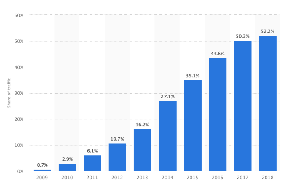
The first iPhone became commercially available in 2008, and in 2009, only 0.7% of people were viewing websites on a mobile device. Nearly a decade later, in 2018, 52.2% of people reported viewing webpages from their mobile devices.
© Statista
Over the years, Harborside has created dozens of websites for our products and clients. A decade ago, the furthest thing from our minds was how these sites appeared on mobile devices or smartphones. However, today, creating sites with a mobile-first experience is a standard in media and in Harborside’s overall design strategy.
Shifting Strategies
The dramatic shift in user information consumption has changed the landscape of what web designers once had down pat. However, the primary purpose of a website remains—to provide information to a user in a clear, easy-to-use format. The challenges of designing and developing modern-day websites can be at once challenging and exciting. There are many problems to solve, such as menu navigation solutions, dynamic content, and seamless user experience. Users must be able to find what they need quickly and easily.
Core technical skills such as HTML, CSS, and JavaScript are not lost crafts and have evolved to accommodate the dynamic web design landscape. Design skills such as typography, color theory, and standard design principles are still fundamental.
Major design elements that have changed for web design with the shift towards mobile are the organization of content and the placement of valuable information. For example, on Harborside’s largest news-driven site, ascopost.com, the navigation bar was designed to resonate with the many ways our audience may look for content—by disease state, or medical meeting the news was presented at, or video or podcast offerings. Gone are the days of the traditional F pattern and over-the-top graphics—instead, scrolling behavior and interactive elements are the focus of a successful user experience. Simple ideas we take for granted now, such as the "hamburger" menu icon, were a point of contention not too long ago. It was not self-evident to every user the intended function of the hamburger icon as a symbol for menu navigation. As designers, it's our responsibility to push ideas forward, while accommodating the needs of our users. A solution to this problem was to add the phrase MENU in combination with the icon and invest in the belief that eventually, designers could remove the word MENU once users became used to such a function.
What to Look for Next
Now that the vast majority of businesses have accepted the migration towards a mobile-first website experience, what's next? Most companies are trending towards offering is a wider variety of video and audio content. With the growing amount of bandwidth provided by data companies, there are fewer limitations on what format of information websites offer for their users. I predict we’ll see more interactive and dynamic content with the use of HTML5 and JavaScript. Finally, websites will become more accessible to groups of individuals with disabilities. Offering audio translations, visual enhancements, and simplification options will become the standard.
We can try our best to predict where the future of web design is going, but there's no guarantee a game-changing technology isn’t around the corner, waiting to unravel all that we think we have learned. The best we can do is stay up to date with technology and trends while learning how to apply these changes to improve the user experience.
If you like this article, check out some of my others at Medium.com/@micbuckcreative.